Roles: Level Designer Time: 8 Months
Team Size: 16 Engine: Unreal Engine 4
Driftlight is a 2.5D Platformer where the player can shift their own gravity and the gravity of objects. My role on this team was to concept mechanics, levels, and educate my fellow designers in level design practices, as well as set dress and create minor scripting events in order to add polish to levels. I worked closely with our lead designer to conceptualize and design our game's central mechanic as well as a variety of elements that gave our game life.
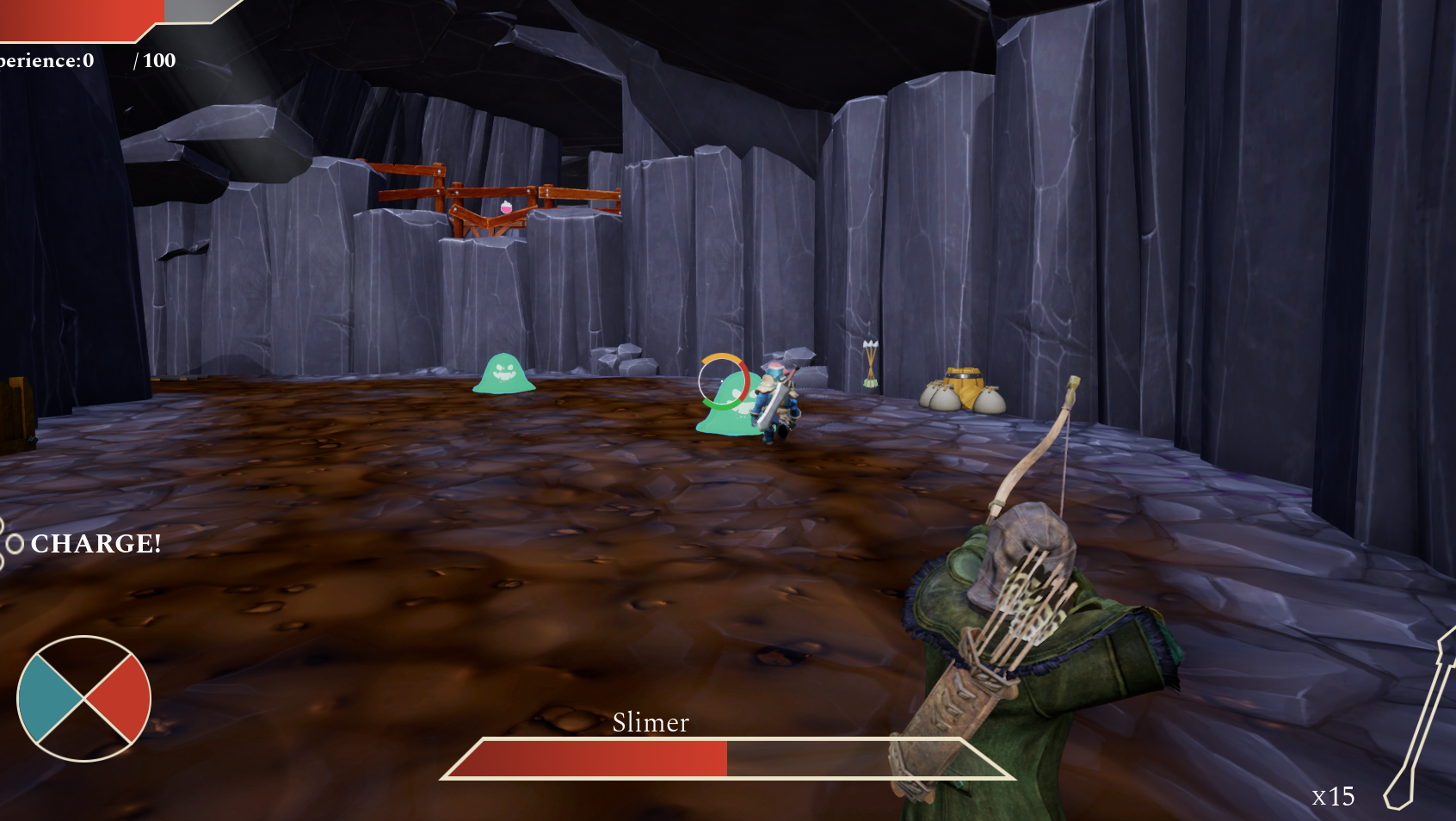
One of the earliest attempts at a visual for Wayfall back in January

Wayfall's current visual style
Driftlight (known through development as Project Replay) is a 2.5D platformer that I helped develop a visual style for from its earliest concepts to the final result in late may. Currently our game has over 10 levels of content, and is expected to have about 30 minutes of gameplay thanks to our pipeline and spiral development strategy. Below I documented my journey working as a level designer on this project and how I influenced the work flow of my peers through actions and educational material.



Starting out we had a simple idea: A traditional platformer where the player could shift their gravity once every time they stood on a solid surface. standing on new surfaces allows the player to change their gravity but a resource meter will drain until they stand on the ground again.




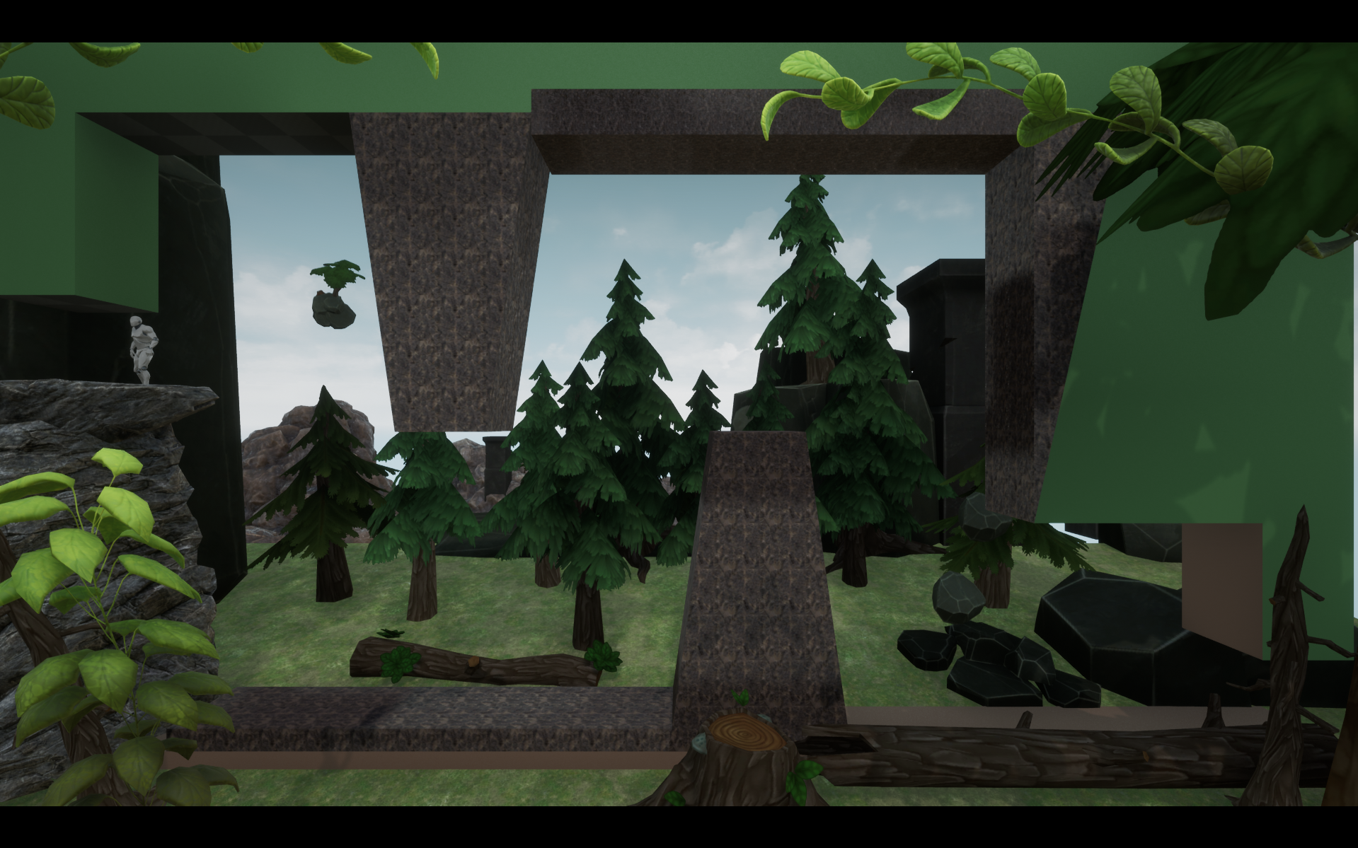
For example, here's the process for "Basic Algebra", a level that asks players to jump, flip their gravity, then cancel it in mid-air, to show their mastery of our powerful air mechanics. The goal of this particular pass was to create floating rocks, and to begin exploring art-chosen asset packs while waiting on proxy models.

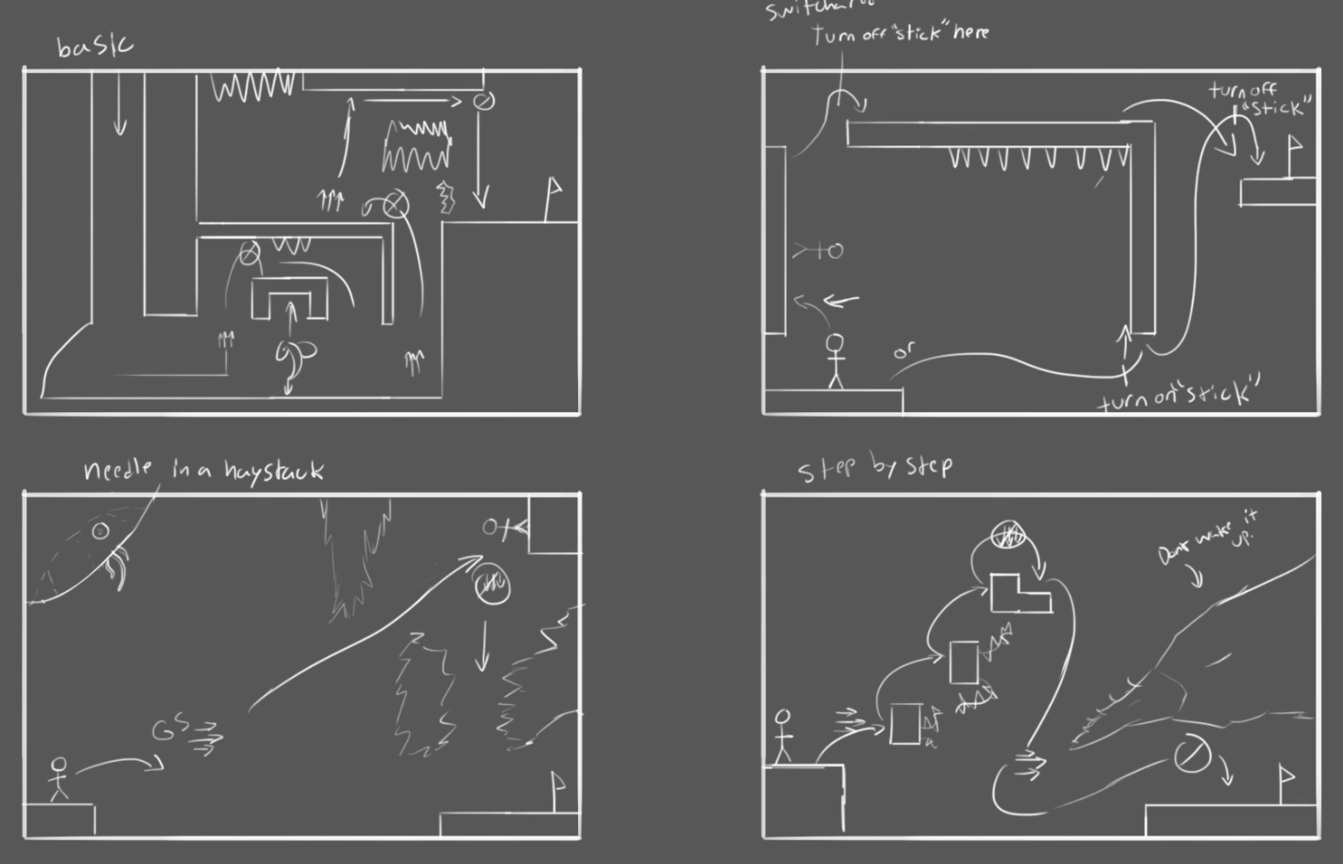
A quick sketch of a level that would become our Visual Target level

A first, barebones whitebox allowed me to test mechanics without visuals

After finding out that our spiders were still buggy, I made a level that relied on them less
After some mild iterations and secondary sketches, we had our whitebox!

Working with asset packs, I found things lacking and hard to read
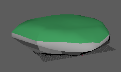
In order to improve platform visibility, I rapidly created simple meshboxes in Maya.

In order to improve platform visibility, I rapidly created simple meshboxes in Maya.
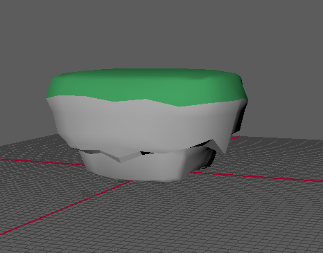
In order to improve platform visibility, I rapidly created simple meshboxes in Maya.

A quick napkin concept of the central column

In order to improve platform visibility, I rapidly created simple meshboxes in Maya.
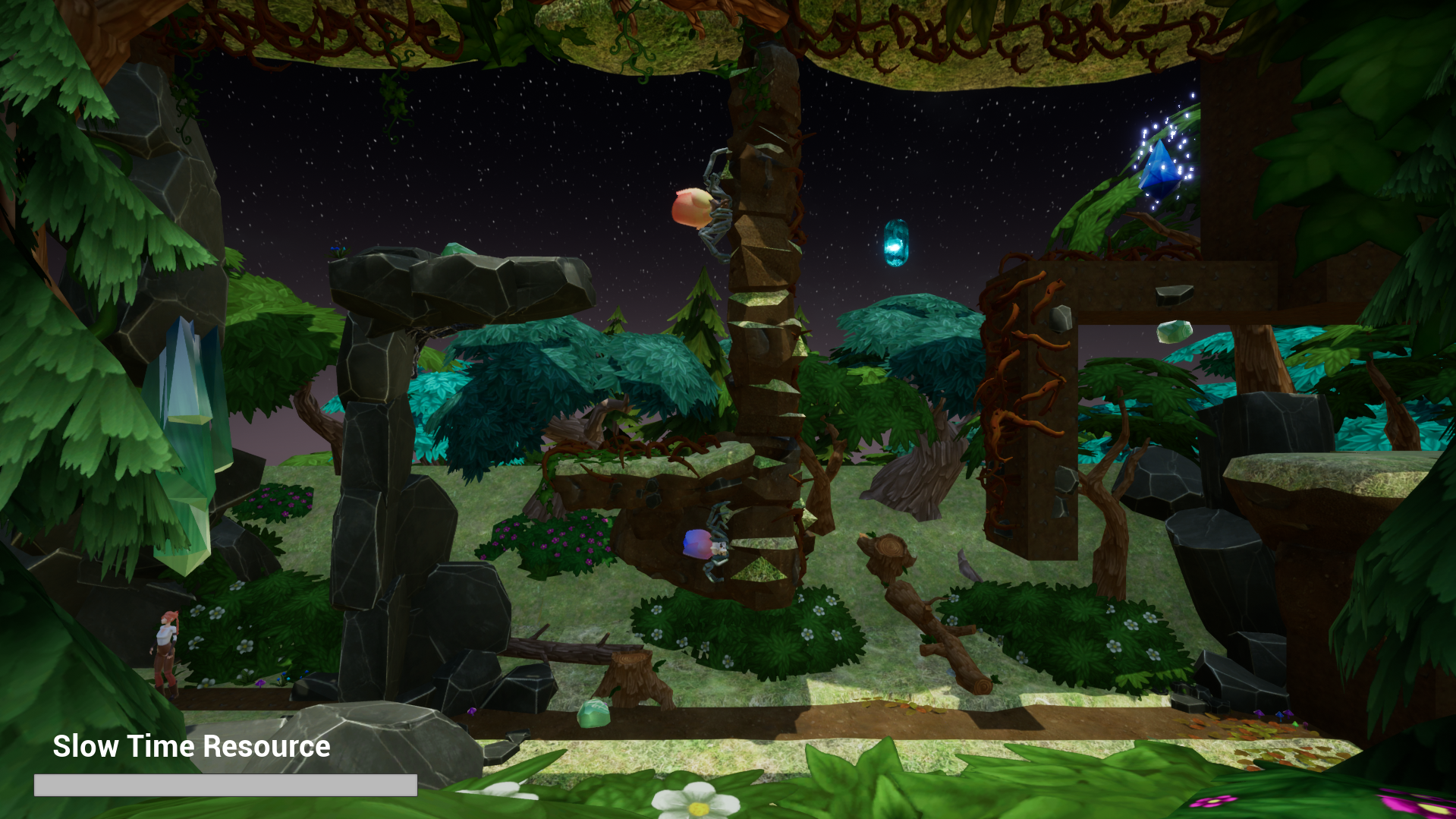
adding meshes showed instant results to clarity and beter play with lighting
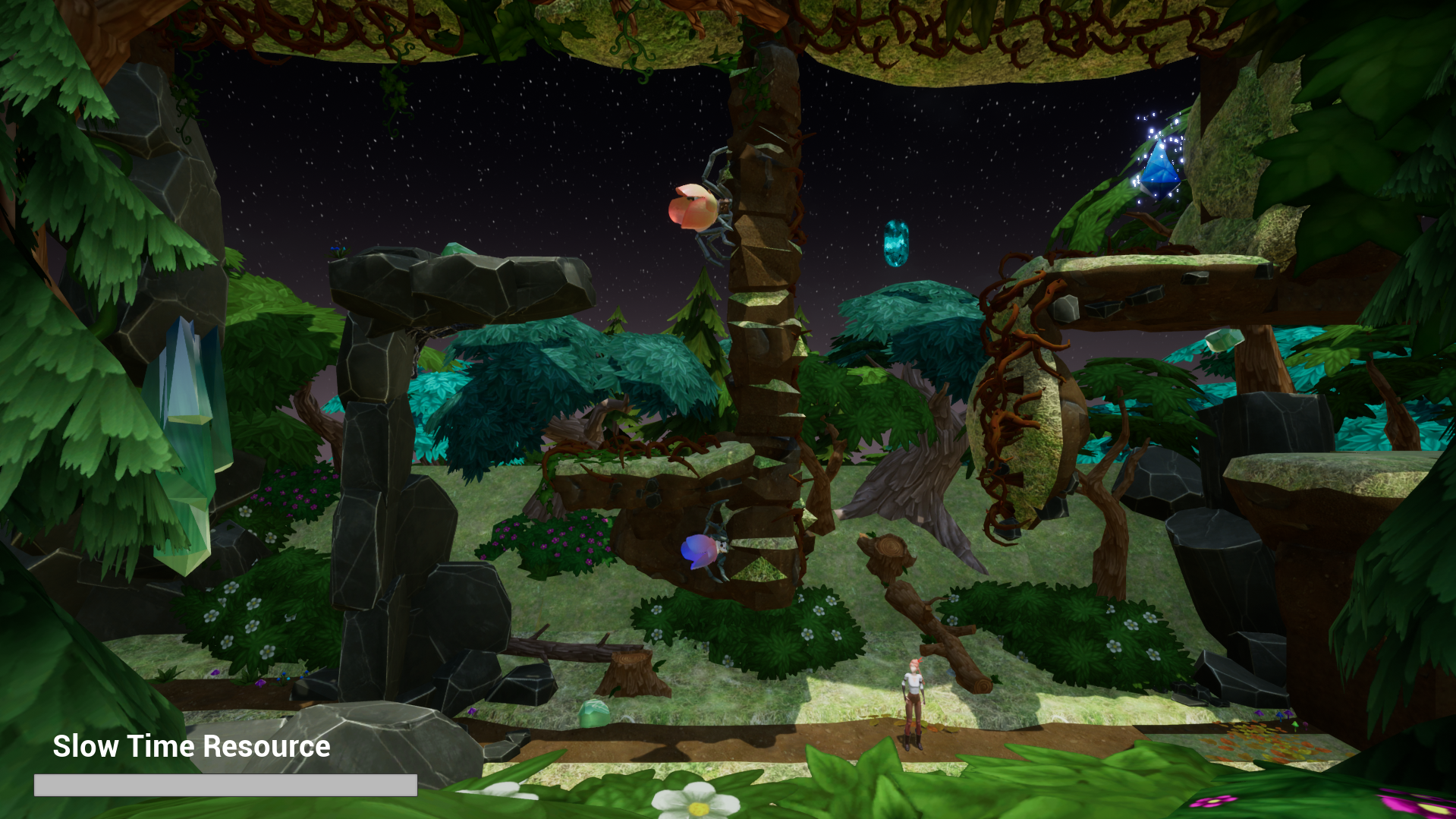
reducing blockiness while keeping interactive clarity was a huge gain
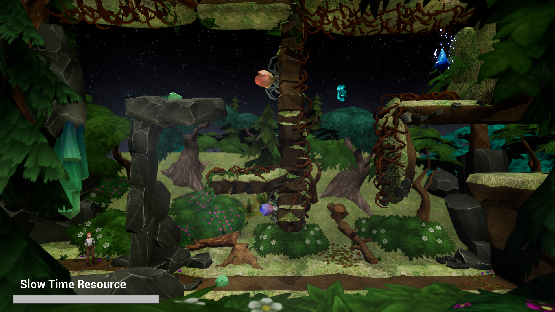
The final product after a short lighting and post processing pass.
For Vertical Slice, I spent 42 hours working on a level I called "Spiders Rock". This would be a second or third level involving the spiders. Players would be tested on their ability to kill spiders and navigate tough corridors in a small, controlled setting. With little time until presentation I was able to create 5 different ground meshes that would help me create more visually distinct platforms without putting pressure on our art team. this would also begin to help our artists with understanding the game's unique needs. During Initial development of the level, I was asked to drastically change the level several times in order to alleviate potential risks in bug-fixing, requiring me to adapt with sometimes only hours remaining.
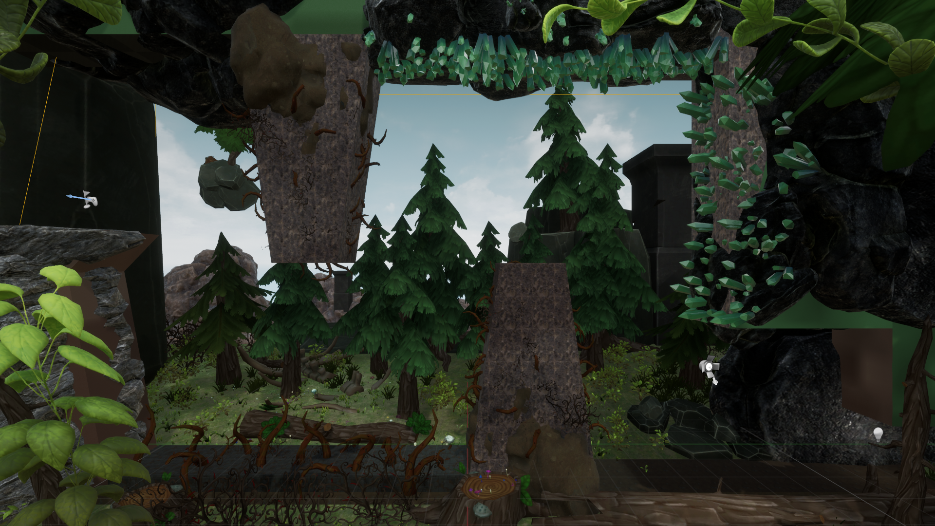
A third and final iterative attempt at a forest themed environment. While we would swap over to a cave-based game environment, this work was crucial in helping understand what our hazards would look like for both our artists and our designers. A simple idea of Stable crystals and moving crystals was an idea I tossed in, where as red meant moving, and blue meant stable. Both acted as hazards but would present different simple challenges to movement.
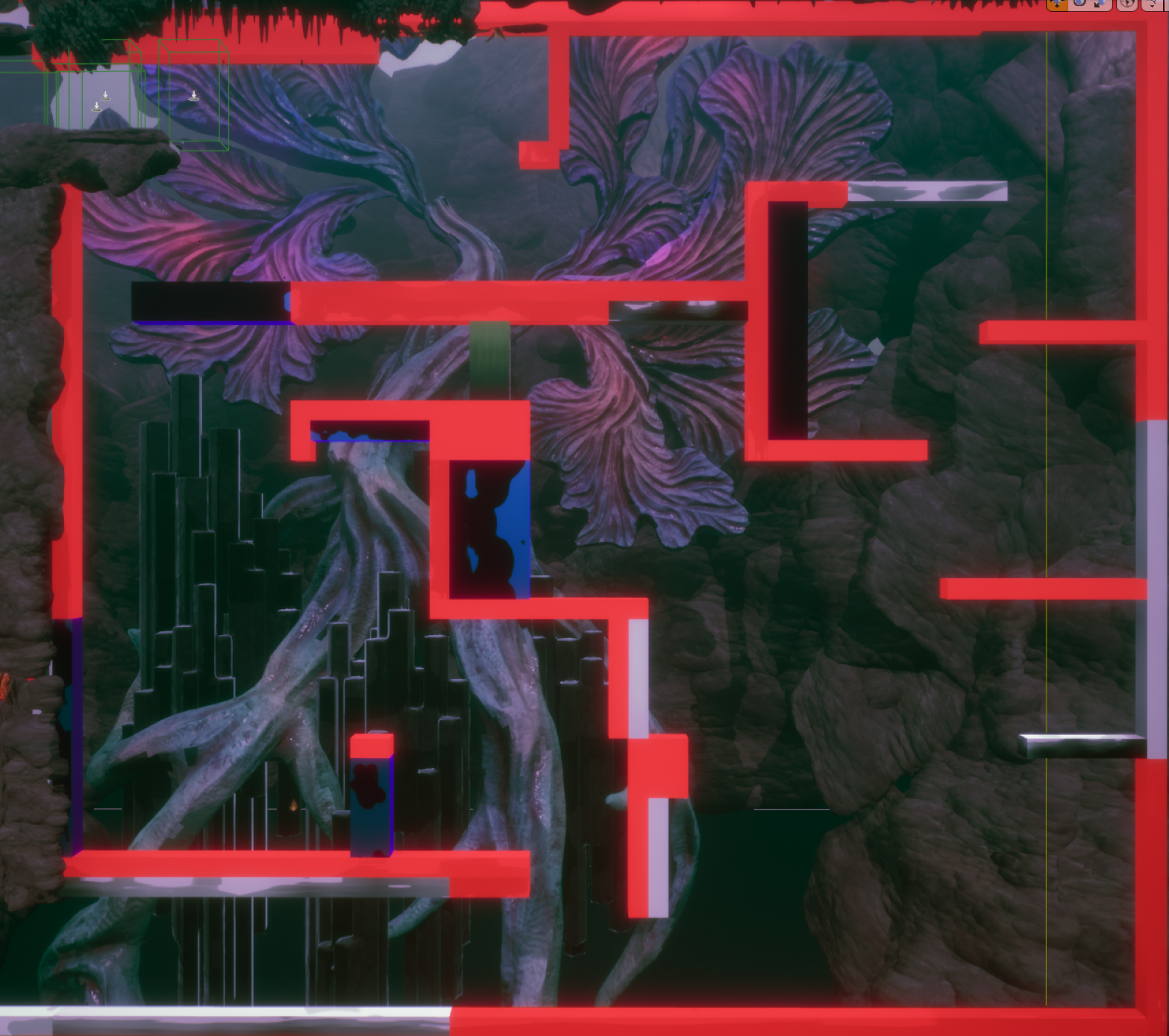


A set dressed environment from start to finish in our new cave environment. I worked with my design lead through multiple phases of feedback to deliver on this level over the course of a 16 hours in order to achieve the desired look for hazards and environments. Throughout my exploration, I worked in a particular system that felt useful for platformers: levels Are divided into streaming layers, with a base "interactive" level and then overlayed with a functionless set dressing level. This system gained notice from my fellow developers and became the primary system for how we built (and continue to build) levels throughout the project. It was exciting to see the team adapt to and adopt methodologies that came naturally to me, and see how it improved their workflow, as well as the workflow of the entire project.
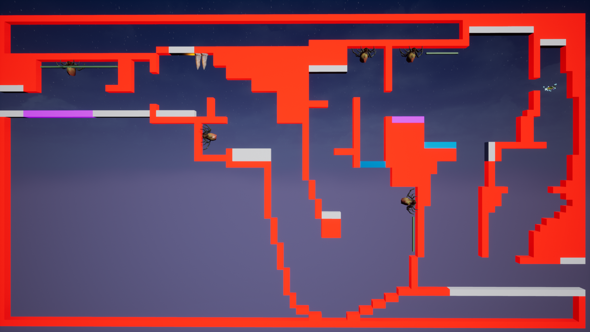

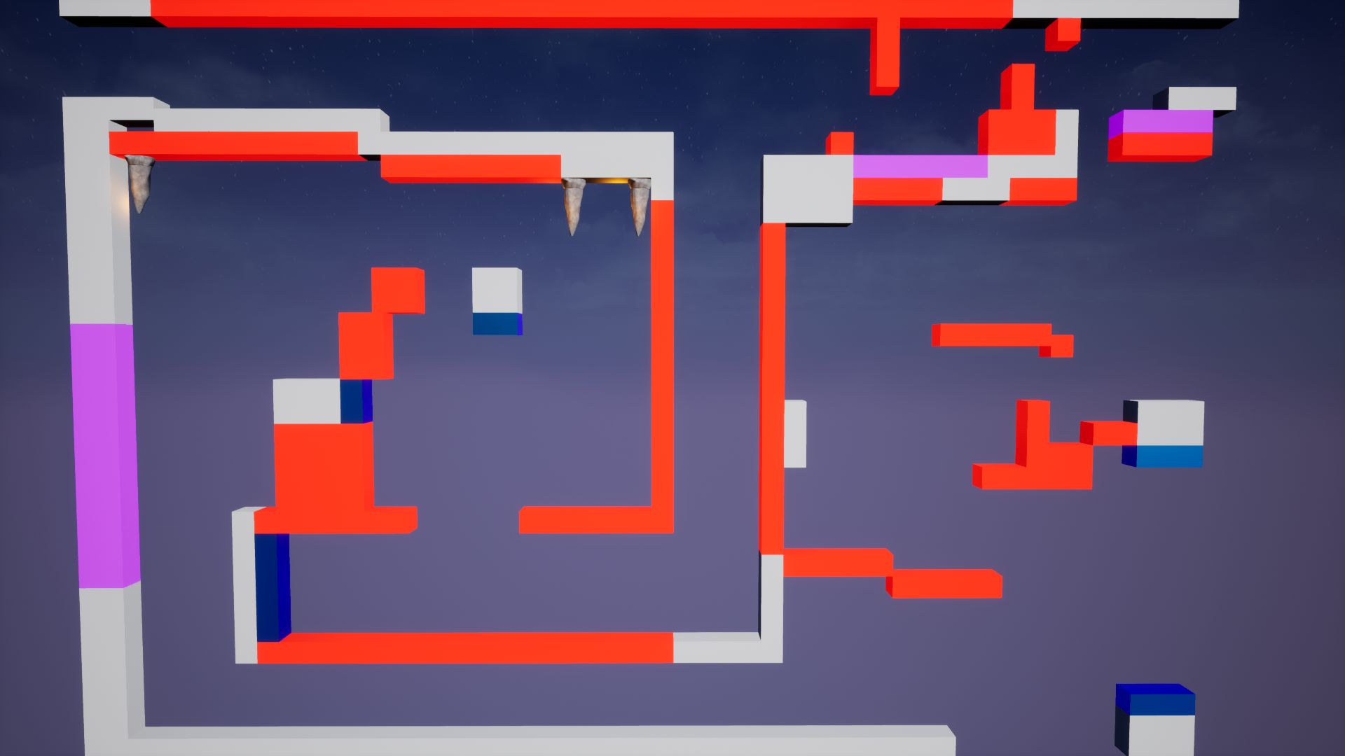
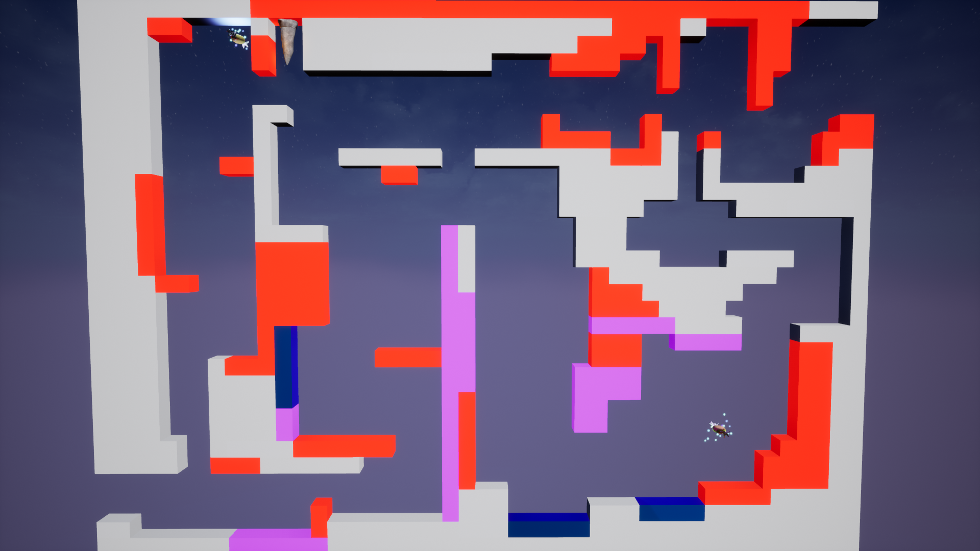
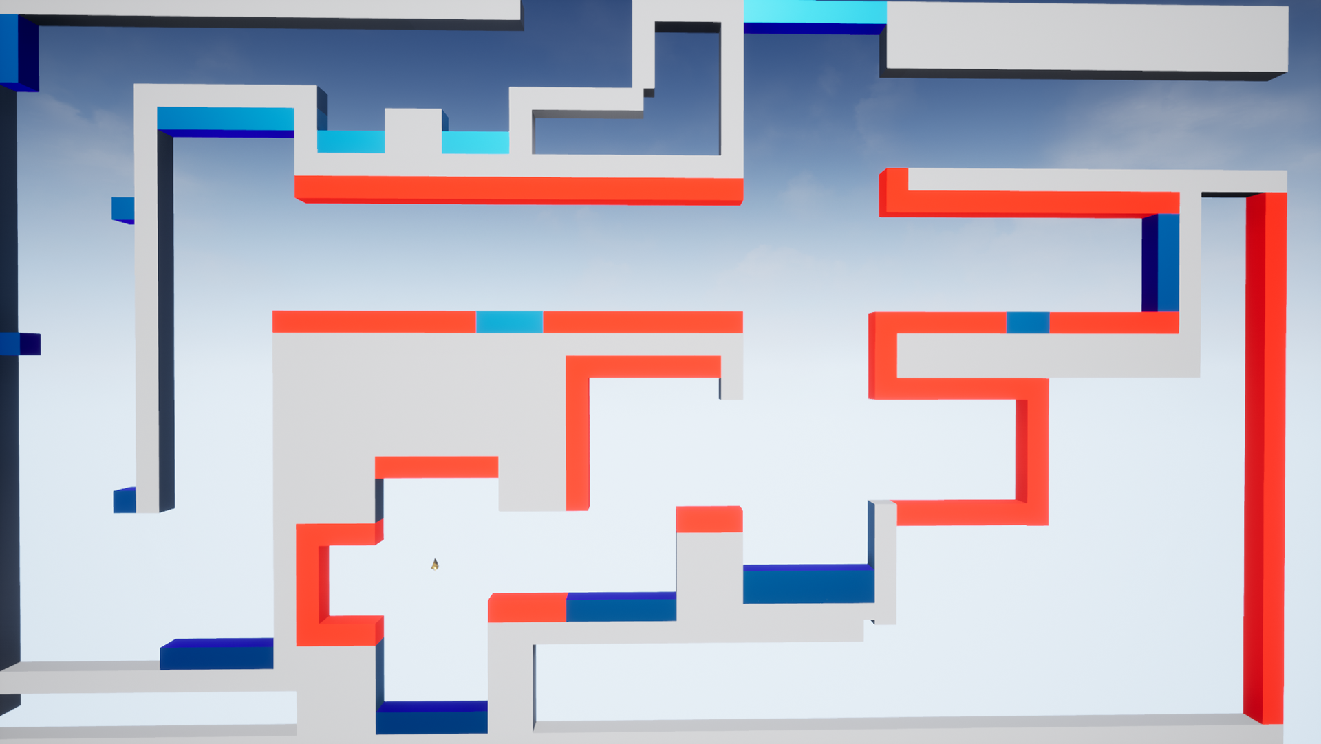
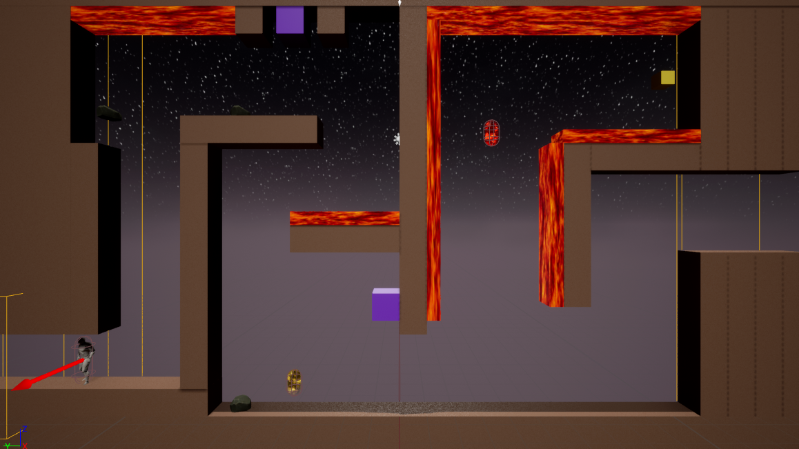
Some of the whiteboxes I'm currently working on as of the most recent update. Blue areas denote bounce pads, white areas are walkable surfaces, red are dangerous areas (instant death), and purple areas are "sticky", exploring a mechanic that takes away your ability to jump and making you rely more heavily on gravity shifting.
